Posts

Showing posts from November, 2017

Information Graphic, Part 4: Final Design

Image
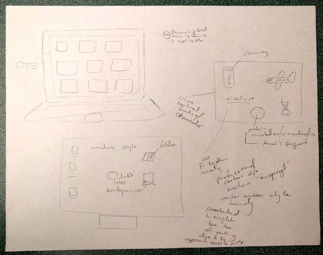
     Our team has settled on a finalized design for out infographic, which we hope addresses the major concerns raised in class. It is designed to appeal to an audience of WPI students majoring in biology with limited computer science (CS) experience. Its purpose is to convince these students that is worthwhile to take some CS-related classes, particularly CS 1104 (the introductory CS course for non-majors, which is taught using Python) and BCB 100X (a bioinformatics course). This final version of the graphic appears as follows: These are the key issues we believe this version of the graphic addresses: Issue #1: The focus seemed to be promoting the bioinformatics major instead of encouraging biology students to get computer science experience.      The topic of the graphic has been refocused back away from bioinformatics and towards a broader look at applications of computer science. We have updated both the wording and statistics used throughout our graphic to reflect this.

Information Graphic, Part 3: Redesigning our Graphic

Image
Drafting Process      With the feedback we received from Professor deWinter in mind, we set out to remake our graphic so that is specifically focused on encouraging biology majors to get some computer science experience. Almost immediately, we got the idea to use an image of DNA as the central focus of our infographic. DNA was a perfect choice not only because it is fundamentally related to biology, but also because its form is that of two interlinked strands. This linked structure works very well with the message we are trying to convey that computer science is relevant and important to biology. Our more narrowed focus also allows us to suggest very specific classes for biology students to take at WPI if they wish to expand their computer science knowledge. The two we chose are CS 1004, the introductory computer science course for non-majors, and BCB 100X, a bioinformatics and computational biology course. CS 1004 also has the added bonus of being taught using the language Python,

Information Graphic, Part 2: Refining our Concept

Image
Further Brainstorming      After meeting with Brandon and Sahil to discuss our plans, we decided to make our information graphic about how Computer Science (CS) is relevant to many majors. Specifically, we would look at how various coding languages are used in different fields. The intended audience would be any students at WPI who are unfamiliar with CS, and the purpose would be to explain how they could apply CS to their majors and the benefits of doing so in order to encourage them to look into learning more about a relevant coding language to their field.      The basic concept for the graphic was a computer monitor (representing CS) with an assortment of images on it symbolizing different majors. Each image would have a bit of text linked to it explaining what coding language is most applicable to it and how it is used. Our rough ideas for the layout were as follows:      The image on the right was a very literal representation of our visual concept. The leftmost two versi

Information Graphic, Part 1: Initial Thoughts

     We have just received a new assignment: to create an information graphic. For this task, I will be working collaboratively with Brandon Sanders and Sahil Nawab . While we do not have a client we are creating this image for, we do have a set of affordances which our final product must conform to: the graphic must be no larger than 8.5" by 11", it must have a centralized story tying its elements together, and it must have a cohesive, logical color palette. Our particular image will convey information under the theme of college majors and professional development.      While we have not formally discussed a plan as of yet, we have begun trying to find commonality between our interests. Both Brandon and I are Computer Science (CS) majors (I am also an Interactive Media and Game Development double-major), while Sahil is a Biology major. Since CS is important to some areas of biology, we may be able to focus our research and graphic on the applications and opportunities prov

Yeti Expedition Escape Room Font, Part 3: Final Design

Image
     After establishing the shared elements we wanted to incorporate in our final font, Jessica and I decided to independently draw the title for the escape room given to us by the client, "Revenge of the Yeti," in our interpretation of our font design. After doing this, we would reconvene and compare the results to figure out how to completely unify our ideas. The results of this are as follows: (My rendition is on the left; Jess's is on the right.)      While not exactly identical, our designs were fortunately extremely similar. The only real differences were the side that was shaded, how rounded certain corners on the letters were, and the style of the letter tops. For our unified, final design we decided to keep the shading on the left side (so it conflicts less with the ice details), make concave corners somewhat rounded, give wide letter tops a slight downwards curve with a peak on each end, and to give narrow letter tops a chisel shape.      The last rem

Yeti Expedition Escape Room Font, Part 2: Collaborative Design

Image
      Jessica Hatt and I decided to work together to create a new font combining both of our rough draft ones. Both of us had done a font focused on conveying the idea of cold by using icicle-like motifs on our letters. The main differences between our fonts were that mine had letters with an aspect ratio between 1:2 and 3:4, had one or two slight triangular peaks on the tops of letters, and had serifs, while hers were closer to square, had chisel-shaped points on top of letters, and lacked serifs.      After comparing designs and brainstorming, we settled on a set of design elements for our final font. The letters will all have a roughly 25 to 30 degree slant from vertical towards the right, which helps convey a sense of rushing and urgency. Their lines will have a moderate, consistent thickness. The font will be sans-serif, but it will retain the icicle details in the places our two fonts used them: primarily the upper-left inside of curves, the lower-right outside of curves, and u

Yeti Expedition Escape Room Font, Part 1: Initial Design

Image
     In our Visual Rhetoric class, we have been tasked with creating a font to be used in an escape room game that will be run on the Worcester Polytechnic Institute campus. The escape room will be themed around a expedition up a frigid mountain that happens to also be home to a yeti, who is presumable not too happy about the intrusion of climbers on its territory. We were given only the basic theme of the escape room and the the following set of keywords for inspiration: Everest expedition, sherpas, cold, tents, oxygen, and yeti.      For my initial design, there were a few key elements which I knew I wanted to include. I wanted the font to appear bold and eye-catching, but also not look too formal so that it would draw attention and convey that the event is supposed to be fun. I also was very interested in attempting to convey the sheer cold of Mount Everest through the visual style of the font.      In doing research on the mountain and the local inhabitants of the area, I found a

Welcome!

This is the Visual Rhetoric blog of Joseph Henry Stadolnik IV. It was created for the B-Term 2017 session of WPI's Visual Rhetoric course, taught by Professor deWinter.