Yeti Expedition Escape Room Font, Part 1: Initial Design
In our Visual Rhetoric class, we have been tasked with creating a font to be used in an escape room game that will be run on the Worcester Polytechnic Institute campus. The escape room will be themed around a expedition up a frigid mountain that happens to also be home to a yeti, who is presumable not too happy about the intrusion of climbers on its territory. We were given only the basic theme of the escape room and the the following set of keywords for inspiration: Everest expedition, sherpas, cold, tents, oxygen, and yeti.
For my initial design, there were a few key elements which I knew I wanted to include. I wanted the font to appear bold and eye-catching, but also not look too formal so that it would draw attention and convey that the event is supposed to be fun. I also was very interested in attempting to convey the sheer cold of Mount Everest through the visual style of the font.
In doing research on the mountain and the local inhabitants of the area, I found a few pieces of information which helped to further inform my font design. Excluding the mythical yeti, essentially no plant or animal life inhabits the upper portion of the mountain (Tenzing & Venables, 2017). Thus, I decided to avoid making the font suggest anything organic besides the mountain itself and its weather. While the yeti appears to be a notable part of the escape room, its status as a mythical being makes it feel more appropriate to avoid directly referencing it in the font through means like making parts look furry. In addition, I also found that Everest often has extremely high winds (Tenzing & Venables, 2017), and that the summit is covered by snow in both a very hard layer and a softer upper one that varies in depth from twenty to five feet over the course of the year (Tenzing & Venables, 2017). This makes my initial plan to have the font convey the idea of cold especially relevant. The only other detail I found which I wanted to consider incorporating was that the Sherpa, a group of people who live around the Himalayas, placed prayer flags on the lower portion of the mountain (Tenzing & Venables, 2017), which I could try to incorporate by making curved parts of letters reminiscent of the silhouette of a string of prayer flags.
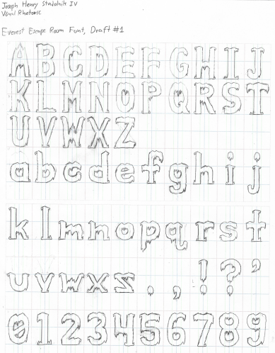
With all of this in mind, I decided that the key visual feature of my font should be spike-like serifs and small downwards-pointing spikes reminiscent of little icicles. This directly and intuitively conveys cold, even if icicles might not be very common on a wind-scoured peak. To make the font more specifically referential of Everest and the Himalayas, I added slight triangular peaks, often in pairs, to the top of most letters which resembled mountains. I did not try to include the prayer flag idea, as I had difficulty finding a way to fit it into the rest of the aesthetic.
The rough draft of the font appeared as follows:
References:
Sherpa.
(2017). In Encyclopædia Britannica.
Retrieved November 8, 2017, from
Tenzing,
N., & Venables, S. (2017). Mount Everest. In Encyclopædia Britannica. Retrieved
November 8, 2017, from http://academic.eb.com/levels/collegiate/article/Mount-Everest/33358


While I absolutely agree that the icicle effect makes the letters feel a bit furry, and thus fits in nicely with the yeti theme, that particular detail had been completely unintentional. As I mentioned, I had originally planned to avoid suggesting the yeti too heavily due to it's mythical nature, but I think it works out for the better that a side effect of the ice is a furry appearance, as it ties the font more firmly with that the client seems to want.
ReplyDelete