Final Project, Part 1: Getting an Idea
For our final project, we don't actually have a specific assignment. Instead, we get to choose pretty much anything that ties into the topics we've covered in this course. Unfortunately, I didn't have any specific idea in mind, so the lack of a specific focus here was actually rather daunting. I'm also working alone for this project, so I can't really get ideas from a collaborator. And as a further wrinkle, we have to scope this project to be completable by Thursday, December 14 in parallel with our map project. While being expected to be making a smaller product is kind of nice, it also rules out a lot of interesting possiblities because they would take too much time
Thus, I decided to start by trying to find something that I would find personally relevant. I am a CS and Interactive Media and Game Development (IMGD) double major, and am an active member of the Game Development Club (GDC) here at WPI. In my free time I sometimes dabble in making games and drawing pixel art (and occasionally voxel art, which is essentially just 3D pixel art). Clearly, it seems like I should do something related to game design or the IMGD major, and ideally it would use a type of art I am familiar with.
This idea seemed rather promising. It would be using software I was very familiar with and a type of art I am fairly confident in. I knew I could find all of the information it required from the IMGD department website, so hunting for data would not be an issue. However, as I examined the different tracking sheets I realized that this was not as feasible as it sounded, especially in the scope of this project. The portion of the requirement that differs between the tracks is about 16 classes, and that alone would be a lot to convey on a controller. Add on all of the other shared classes, and you have a very busy, complicated infographic. If I had more time it might be possible to pull together, but I don't think such a graphic would fit well in the scope of this assignment.


Thus, I decided to start by trying to find something that I would find personally relevant. I am a CS and Interactive Media and Game Development (IMGD) double major, and am an active member of the Game Development Club (GDC) here at WPI. In my free time I sometimes dabble in making games and drawing pixel art (and occasionally voxel art, which is essentially just 3D pixel art). Clearly, it seems like I should do something related to game design or the IMGD major, and ideally it would use a type of art I am familiar with.
Idea #1: A Logo
My first thought was to do some sort of logo to represent the IMGD major or the GDC. I could try, for example, to stylize the acronym IMGD into a game controller. However, I not only have never had any experience making a logo, but also am almost completely unfamiliar with vector graphics tools like Illustrator (which would be ideal for a logo). Thus, I opted to reserve this idea as a fallback in case I couldn't come up with anything else.
Idea #2: An Infographic
My next idea was to make an infographic showing the different tracks in the IMGD major. You can be an IMGD Tech major or an IMGD Art major, and while the two have a pool of shared required classes, they rest of the classes needed are significantly different. To further complicate matters, the IMGD Art track has 4 different variant, each with slightly different sets of courses: students can have no concentration, a Visual Art concentration, a Design concentration, or a Technical Art concentration. This naturally can be a bit confusing, so I thought that creating an infographic which compares them could be useful to students. I wanted to represent the IMGD major as a game console with two controllers attached, one for each major track, as this is immediately recognizable as related to games. The shared courses would be visually represented on the console itself (perhaps in a pie chart showing distribution by subject), while the track-specific courses could be indicated by the button layouts of the two controllers. There could also be a memory card connected to the console to symbolize the humanities and arts, social science, physical education, and IQP graduation requirements, since those can be applied (or, metaphorically, "plugged in") to anyone's major (as a memory card can be moved between individual consoles). I would make the console and controllers as a voxel model, and I could use pixel art for the title text as well.This idea seemed rather promising. It would be using software I was very familiar with and a type of art I am fairly confident in. I knew I could find all of the information it required from the IMGD department website, so hunting for data would not be an issue. However, as I examined the different tracking sheets I realized that this was not as feasible as it sounded, especially in the scope of this project. The portion of the requirement that differs between the tracks is about 16 classes, and that alone would be a lot to convey on a controller. Add on all of the other shared classes, and you have a very busy, complicated infographic. If I had more time it might be possible to pull together, but I don't think such a graphic would fit well in the scope of this assignment.
My sketch of this design was as follows:

Idea #3: A Font
Once again I was back to square one. Fortunately, I quickly got a new idea that would be much more feasible, but would still relate to both my interest and abilities: I could make a pixelated font designed for coding. In order to serve this purpose, the font must have several key properties: it must be monospace (to ensure that code lines up consistently), its characters must be easily readable and clearly distinct, and it must incorporate punctuation and other common non-letter symbols (since many of them are used in code). I am choosing a pixelated style because I personally really like the look of pixel art, and because it is commonly linked to games, which require significant amounts of coding to create. The audience for this font would be people like me who have an interests in coding, pixel art, and the most prevalent combination of the two: making games.
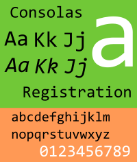
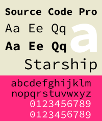
Before I really start on drawing the font, I need to know what existing monospace and pixelated fonts do so I can think about what elements I do and don't what to incorporate into mine. Some examples of monospaced fonts include:
The most distinctive trait across nearly every monospace font I can find is that, regardless of whether the rest of the letters use them, they put serifs on very slim letters like i and l to make them fill more of the space, so I should definitely look into including those in my own font. Fixedsys, which actually appears to be a pixelated monopace font, makes almost every line 2 pixels wide, rather than just one, and it never has lone pixels connected only by their corners, both of which I feel help improve its readability.
One other pixelated monospace font I'm very familiar with is the one used in Pico-8. For the uninitiated, Pico-8 is essentially a virtual game console you can make and play games for, which I happen to be a huge fan of. One thing I've noticed is that people have rather mixed feelings about its font choice. Here's what it looks like:
While the font doesn't particularly bother me, I have heard complaints from people in the community that some of the letters (especially B) are hard to identify, and I can definitely see what they mean. I'll even readily admit that detailed characters like @, #, $, and & are difficult to make out. The whole reason this font has issues like that is that it is designed so that every character is 3x5 pixels, which is absolutely tiny. It is pretty much necessary for Pico-8 because of the 128x128 pixel resolution it runs at (even in the editor), but for other applications this is needlessly restrictive. Pico-8 is also kind of an odd case, since it only lets you type in lowercase letters. Its font appears to use almost exclusively uppercase ones (with certain exceptions, notably n being lowercase), but the characters themselves are technically all lowercase. Many coding languages are case-sensitive, however, so I would want to differentiate upper and lowercase letters in my own font.
After looking at these fonts, here's the list of what I've decided I want mine to do:
- Distinguish between upper and lowercase letters
- Include common symbols and punctuation in addition to letters
- Use serifs at least on the i and l
- Make diagonals more than 1 pixel across to improve readability
- Don't constrain the font to too small a pixel scale. 8x16 (with 4-5 pixels of space reserved for both ascenders and descenders) should be adequate.
References:
List of monospaced typefaces. (2017, December 5). In Wikipedia. Retrieved December 12, 2017,
from https://en.wikipedia.org/wiki/List_of_monospaced_typefaces


I really liked seeing your thought process of thinking through different options for your final project. I really liked your infographic idea (for some reason the first 2 controller system that came to mind was the Nintendo Switch) to explain the different IMGD paths. Something that Caroline and I emphasized in our comic was that incoming first years would greatly benefit from the comic we created, and I think they could have also been a strong audience for your infographic. However, I also really like your font inspiration ideas. As someone who is an RPG fan (in particular the Dragon Quest and Final Fantasy series), readable fonts are extremely important for game play, so I would assume that they would be very important in creating a game as well. If you ever used the app Tiny Towers, the Pico-8 font really reminds me of that - and I do find some of the letters to be tough to read at first glance. I'm excited to see your draft!
ReplyDeleteYeah, I definitely agree that such an infographic would be useful for freshman to have. If it was feasible, it might even be good to add a third player that's a CS-IMGD Tech double major, since that is a fairly common one and we have our own distinct set of requirements. But that would certainly have brought it beyond the scope of this project if it wasn't already.
DeleteWhile I'm not personally very familiar with the specific games you mentioned (that's not to say I don't like RPGs; I'm a big fan of Pokemon, Undertale, and an obscure one called OFF), I definitely know what you're talking about. If you have to exert effort just to read in a text-heavy game like an RPG, it cripples the whole experience. And looking up Tiny Tower, I can see what you mean by the font being similar, though even that uses a less restrictive 4x5 pixel scale.
I think the final font I came up with would actually be even more appropriate for use in games than originally intended, due to having some slightly script-like elements that give it a vaguely organic, almost handwritten feel.
I really enjoyed reading this post. You have so many great ideas and its really a shame you don't have more time to figure out the issues with the info-graphic as I think it would be a clever idea and I know I certainly got confused even just reading your explanation about the path of the majors. However, I think the font idea is a really cool idea as well. I like how you were still able to include your passion in the final project which I think will make the whole process significantly more enjoyable for you. I am a little confused on the purpose, mainly because I know absolutely nothing about coding. Are you intending to introduce this font as the new standard for coding? Is there an existing standard for coding or does it depend on the program being used? And if it is dependent on the program, do you have a specific program in mind that this type of font could be used for? And if you do have a specific program in mind, is there an audience or type of coder you would expect to have a specific need for this font?
ReplyDeleteMany programming environments let you choose what font you use (Pico-8 is a weird exception). I don't think there is one standard font between them, though pretty much all of them default to some monospace one.
DeleteI'm not trying to make this as a standard, just as an alternative that would appeal to people with similar interests to me. It isn't intended for use with a specific language or program, just for people who like pixel art enough that they would want to see it even while coding (perhaps to help get them in the mood for making games).