Yeti Expedition Escape Room Font, Part 3: Final Design
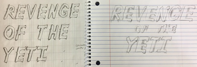
After establishing the shared elements we wanted to incorporate in our final font, Jessica and I decided to independently draw the title for the escape room given to us by the client, "Revenge of the Yeti," in our interpretation of our font design. After doing this, we would reconvene and compare the results to figure out how to completely unify our ideas. The results of this are as follows:

Going along with its dominant icy theme, we decided to name our font Glacial. We believe that this font should suit the client's needs quite well. Its somewhat thick letters catch the eye of passerby, and then the subtler details of the ice and the small peaks hold their attention, which is perfect for a font designed to be used to promote and advertise for something. The hand-drawn aesthetic also lends a bit of lightheartedness and fun to the design, which should help sell the escape room as an enjoyable activity.
In addition, Glacial conveys several more concrete aspects of the escape room simultaneously. The icicles bring a strong association with cold, and also combine with the hand-drawn letters to give an organic, almost fur-like impression to call to mind the idea of a yeti. The small peaks, dark left edge, and overall slope of the letters also all evoke imagery of mountains. The slope itself serves another purpose, as well: it gives the impression of rushing, which fits nicely with the timed nature of an escape room.

(My rendition is on the left; Jess's is on the right.)
While not exactly identical, our designs were fortunately extremely similar. The only real differences were the side that was shaded, how rounded certain corners on the letters were, and the style of the letter tops. For our unified, final design we decided to keep the shading on the left side (so it conflicts less with the ice details), make concave corners somewhat rounded, give wide letter tops a slight downwards curve with a peak on each end, and to give narrow letter tops a chisel shape.
The last remaining design step was to make the finalized, digitized version of our font. Since neither Jess nor I had any experience or knowledge of Illustrator, or for that matter any software ideal for drawing fonts, we instead opted to hand-draw our font and scan it in. To divide up the work and help ensure consistency between our contributions, we split the alphabet between the two of us, so I got every odd-numbered letter while Jess got even-numbered ones. We drew these in pencil on identical grids, which I had set up beforehand myself to help us make sure we used consistent sizes and proportions of letters, and then exchanged papers and went over the other person's letters in ink. This exchange was important, as we allowed each other to tweak letters so they matched our own style a bit more while drawing over them, and thus the final product would (in theory) be a more uniform blend of our work. After completing this, I scanned our drawings in and retouched them using Gimp. This was the end result, and our final font design:

Going along with its dominant icy theme, we decided to name our font Glacial. We believe that this font should suit the client's needs quite well. Its somewhat thick letters catch the eye of passerby, and then the subtler details of the ice and the small peaks hold their attention, which is perfect for a font designed to be used to promote and advertise for something. The hand-drawn aesthetic also lends a bit of lightheartedness and fun to the design, which should help sell the escape room as an enjoyable activity.
In addition, Glacial conveys several more concrete aspects of the escape room simultaneously. The icicles bring a strong association with cold, and also combine with the hand-drawn letters to give an organic, almost fur-like impression to call to mind the idea of a yeti. The small peaks, dark left edge, and overall slope of the letters also all evoke imagery of mountains. The slope itself serves another purpose, as well: it gives the impression of rushing, which fits nicely with the timed nature of an escape room.
I'm curious to see your odd-numbered lettered alphabet and Jess's even-numbered one to see how similar they were before you each traced each others work! I think it was a unique way to split up the project. I like how you kept the shading on the left side of the letters. It does interfere less with the icicles and gives the letters a three-dimensional appearance. I enjoyed the similarity you kept between the letters "U" and "V". While they are distinct, they look like the came from the same, slightly adapted design concept. Great job!
ReplyDeleteUnfortunately, we only made one copy of each, so the un-traced versions don't exist. They were pretty similar though, with the main difference being (unintentionally) how slanted the letters were. Fortunately, Gimp has a tool that lets you skew an image, so the difference was easy to correct. The final slope is partway between the ones Jess and I used.
DeleteAnd it's funny you mention the U and V being similar, because with the way we divided the alphabet I drew the U while Jess drew the V. The similarity is pretty much just the result of our shared plan for the font.
I appreciate how well you thought out the process of digitizing your font--using special grids and a two-step process of drawing the letters. What did you use for inking the letters? I don't have any experience with Illustrator either, but in my case I did all of the design work digitally so I didn't need to scan anything.
ReplyDeleteKeeping the shading on the left side of the letters was definitely the right choice in my opinion--having the shading on the right side would have conflicted with the effect of the deliberate forward tilt you put on the letters, while the shading on the left side complements it. The left-side shading makes the letters pop out towards the right, just like they are leaning towards the right.
It was really interesting to me how you divided the work load - I was a little confused with your description of how it was split up (odd versus even), but I can't see a difference in style in your final font so it was obviously a very effective method! It was great that you could both take your very similar initial drafts and combine their best properties into a really polished final draft. Katie and I also struggled with Illustrator, and we both wished we knew how to use a simpler editing tool (like Gimp - I want to know what this editor is and how to use it). You guys did an awesome job overall!
ReplyDelete