Humanities and Arts Comic, Part 2: Characters and Rough Draft
After our brainstorming session, Jess and I each sketched our own ideas for how the characters representing each discipline could look. We also had been considering having one established as the "leader," who would do most of the talking.


The rough designs I came up with were as follows:


My "leader" character was based off an idea we had tossed around in brainstorming, where they appeared as just a well-dressed figure with a mask. My interpretation would have the mask be WPI's seal, and the figure to be none other than Gompei himself. Foreign language was intended to be a dictionary with a globe one it, rhetoric was a podium with a face, theater was a comedy and tragedy mask duo, history was a suit of armor, literature was formed from a stack of books with glasses, and the arts were represented by a palette with a paintbrush and a pencil for legs. The sad checklist was intended to represent the Breadth and Depth requirement, as it could easily feel like just going through the list of classes and just picking ones to "check off the boxes" of what you needed. I'm not terribly happy with most of the designs I came up with, but that's alright since Jess had her own ones we could use.
These are the designs Jess came up with:


For the comic, we decided to stick to Jess's designs for the most part, and use her book character as the "leader." We did decide to retain my sad checklist, though.
The rough draft of our comic appeared as follows:


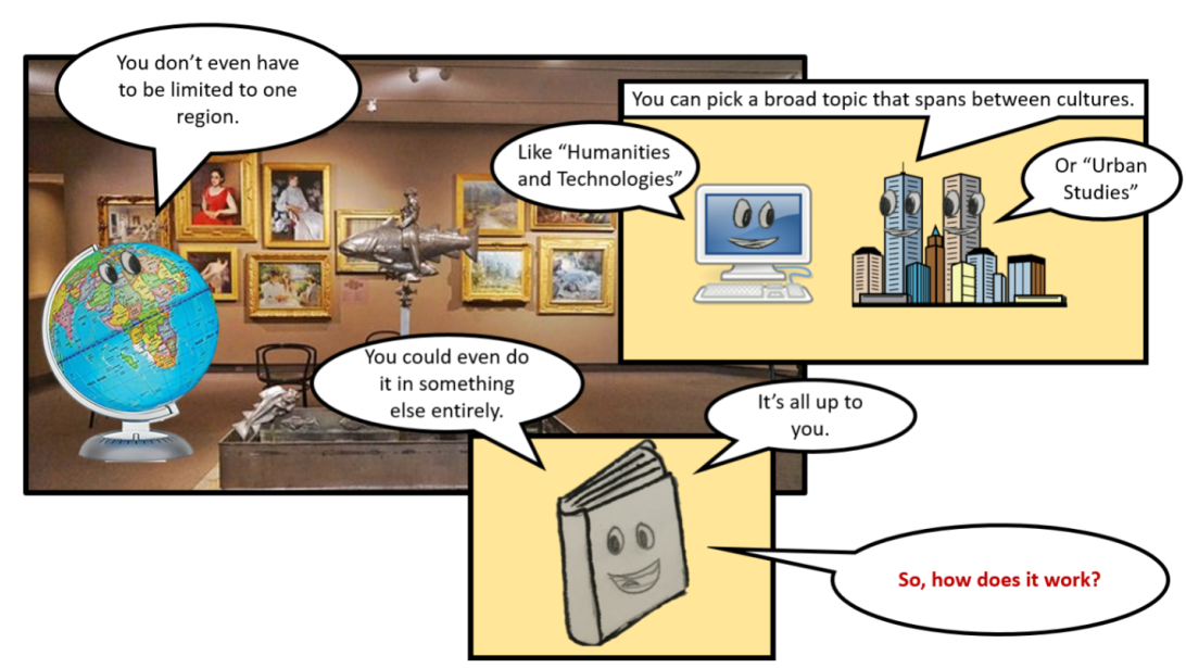


We showed this draft to Professor deWinter, and she seemed rather happy with what we had so far. She pointed out, however, that we had the last step of the process for choosing the Thematic Approach wrong: you don't get it approved with your academic advisor. Instead, students approach the professor running the Seminar or Practicum they are interested in, and get their advice to finalize their selection of classes. Professor deWinter also advised that we use an infographic to help explain actual process for the Thematic approach, that we rework the flow on some pages, that we make sure we consider the final arrangement and positioning of the full comic, and that we make the lines on the characters bolder to better match the box and speech bubble style.


I love this comic! Normally, I'm not a fan of combining pictures with art but you guys really made it work here. Also, the variety of framing keeps kept me engaged with the story.
ReplyDeleteAs a whole, you guys have a good inter-dependency between the images and words, which really makes the story come alive. Perhaps my only critique is that there are a lot of text bubbles and --especially in the second to last page -- it gets pretty cluttered. Combing some of the bubbles might help make the text less scattered.
I really like how you focus on the different ideas we had bouncing around at the beginning of the comic design process. I think it really speaks a lot to how we had to adapt with our time/space restraints and also our ability levels. I too was surprised as the person commenting before me said, in the combination of pictures and art. I was really not expecting it to turn out looking good and fully expected that the drawings would be mere place holders. However, I was pleasantly surprised that they are well received. I think it addresses the youth, open mindedness and creativity of our audience and connects to the creative energy that comes off the simple idea of humanities and arts. It also adds emphasis to our characters and makes them stand out. I agree with the person above as well that the second to last page was probably our weakest component and I am so glad we've switched over to using a info-graphic to communicate all that information instead.
ReplyDeleteI really did like some of your drawings! The drawing of the stack of books reminded me of the Cookie Monster for some reason. It did make me laugh. My group chose a similar approach to superimpose cartoon images on real life pictures. You and Jess did an effective job of making that approach work. I do think some of frames are a bit cluttered and difficult to read, like the panel with all of the green backgrounds, but from class today I did see that you both cleaned up the strip very well! I appreciated that you added images instead of keeping a blank background, which was one of the improvements many people suggest for Caroline and to do. I’m excited to see where the final draft takes you!
ReplyDeleteI really like how the comic is set up on this blog - it flows really well in this vertical format. It was also really awesome how you gave suggestions to your client on how the comic could be displayed around the school. I like the idea of a poster, but I am not sure how many people would actually take the time to read it if it were hanging on the wall of Salisbury. I think also having a pamphlet version might make it more marketable. The whole comic is super impressive thought, and I think it's going to come out really well!
ReplyDeleteI wonder how your comic would have had turned out if you had used the Gompei character that you had originally considered instead of a book. I think the use of a book as the main character definitely has an impact on the interpretation of the entire comic. For me, the book conveys a connotation of academic study and reminds me of the library. The book character strikes me as the ARC or the library speaking. It seems to embody the administration of WPI delivering the message of your comic. I think Gompei might have had more appeal to ethos than a book as your main character.
ReplyDelete